Why I hate (and love) visualizations of mathematics
I have a love-hate relationship with visualizations of mathematical ideas.
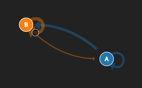
Let’s say I’m trying to learn about a difficult mathematical concept. For this example I’ll use Markov chains because I recently saw a highly-appreciated visualization of Markov chains due to Victor Powell and Lewis Lehe. For now I’ll pretend I’m the typical person who claims to be a visual thinker and the only reason I don’t get math is because nobody is patient enough to explain things in a way I can understand. (Such people are everywhere.)
So I’ve heard the mysterious term Markov chain, and tried to learn about it previously by reading a book. Maybe I want to even write a computer program to “do” a Markov Chain, whatever that means. I go check out the Powell-Lehe visualization and at the end I think “Wow! That was so easy to understand! A Markov chain is just a little diagram with a ball bouncing around, where the ball is represents the state a system, and the thickness of the lines is how likely the ball is to use that line to travel.”
Then I go to whatever forum linked me to the visualization and I say something like “Man, I never really understood Markov chains until now. I had tried to learn them, but my impatient mathematics teachers were so terrible at explaining anything in a way I could understand.” Job well done, all in a day’s work, time to go off and write some programs.
Here’s the problem with this scenario. All I really understand from the visualization is the definition of a Markov chain. In fact, I don’t even understand that all that deeply. The authors of that visualization make a wispy connection between a Markov chain and a matrix (just to “tally” the transition probabilities, they say). But why is a matrix appropriate for that? They claim it’s for efficiency, but as a practiced mathematician I know the answer is much deeper, in fact much closer to the heart of why Markov chains are interesting.
The truth is that the definition of a Markov chain by itself is not at all deep or complicated. That’s part of why the visualization is so effective, because anyone who understands Markov chains could explain what one is to a wiling fifth grader, in five minutes, with just a pencil and paper. I couldn’t explain why they’re interesting to a fifth grader, but visualizations don’t do that either. The true difficulty comes when you actually want to do something with Markov chains. Whether it’s a mathematical analysis or a useful computer program, you need more than a single definition and a picture.
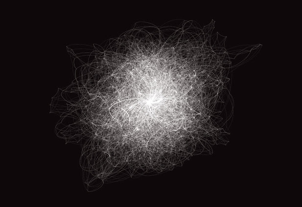
And here’s one place visualization reveal their uglier side. You can’t analyze Markov chains with a visualization. You can use visualizations to get ideas, but you can’t check if those ideas are valid. Markov chains are inherently quantitative but visualizations are qualitative. This is especially true when working with small examples. Because as soon as you turn to any nontrivial large examples visualizations become a useless mess.
Here is what typical visualizations of networks tend to look like:
And identical looking networks can have completely different Markov chain dynamics. So there’s no hope in distinguishing between them just by looking at pictures.
I know what you’re thinking: if I get interested in Markov chains because I saw a neat visualization, then isn’t that all that matters?
Yes and no.
In the hypothetical scenario, I had tried to learn about Markov chains once the “normal” way (by reading a book or taking a class). But the book or teacher didn’t explain it visually for me so I gave up. I just couldn’t wrap my head around it. And now that I am comfortable with the definition of a Markov chain, I need to learn a new concept: how the convergence rate of a Markov chain to a stationary distribution depends on the magnitudes of the eigenvalues of the transition matrix.
WAT
So I look up the animations for what an eigenvalue is, and I look up visualizations of what convergence means, and I look up visualizations of probability theory. Even with all that understanding, it would take a team visualization experts spoon-feeding me for hours to get me to understand why intuitively these particular numbers govern this particular dynamic. (As far as I “know,” matrices are just for the convenience of writing down transition probabilities) And it’s almost guaranteed that the perspectives you’d gain from visualizations of the disparate concepts are incompatible or at least don’t mesh well. Instead I could do things the old fashioned way: write down some small examples, practice the algebra skills I hemorrhaged, and ask questions when I get stuck. In order to gain a deep understanding I need to actively engage the material in a way that visualizations don’t allow. And the ridiculous part is not how inefficient it would be to make visualizations for the mysterious-sounding relationship I described, but that we’re still at the beginning of an introduction to Markov chains!
What I’m saying is that visualization can help, of course it can. But if I’m not willing to put in real work to understand a topic, then I will never get past the visualization. I will just keep complaining that my math teachers were all terrible and that I can’t wrap my head around an idea, when the truth is that I’m being impatient. That’s the number one reason that an otherwise capable person fails to learn math. Maybe if they understood that being confused is the natural state of a mathematician then they’d realize what the rollercoaster of gaining a deep mathematical understanding is actually like. I would argue that this applies to understanding anything, but out of all things people tend to be the least patient with mathematics.
I understand why visualizations are so appealing, I really do. I even make them myself to explain and synthesize ideas. They’re appealing because our eyes tend to glaze over when we see too much mathematical notation in one place. Pictures and animations give us a break from the syntax, and help us connect the general definitions to a simple example.
But notice that nowhere do I suggest (and I argue nobody should suggest) that these pictures replace the notation. You need both and they need to interact with each other. Visualizations and pictures allow you to be specific and vague, whereas more typical mathematical analysis allows you to be precise and general. The two complement each other. So visualizations that try to omit all notation are doing you a disservice, practically ensuring a steeper learning curve when you finally need to translate between syntax and idea. Likewise, mathematics authors that provide no examples and no intuition are also doing you a disservice. Just imagine trying to teach programming where you never show syntax but just draw pictures of the “man inside the machine.” And now imagine you just hand out a list of syntax forms with no connection to an intuitive understanding of their semantics. Both are ridiculous, but the pop-math-visualization crowd are basically demanding the former as a method to become competent in mathematics.
But the real problem, I’d say, is that math literature is too close to the latter kind of author, the kind who is too terse and provides no examples. This is a much subtler issue than whether mathematics is hard, having to do with the culture of mathematics, unwritten expectations of authors, and the limited time and incentive of experts. I don’t have a solution to help someone overcome these barriers. Maybe if we paid math graduates a reasonable fraction of what they could make on Wall Street or at the NSA there would be better resources available. Today any mathematician who blogs or writes a textbook about any topic more advanced than calculus does it as a labor of love; it generally detracts from their career by giving them less time for research, they generally don’t get much (or often, any) income from it, and it takes years to do something substantial. With all of this in mind it’s no wonder they’re so terse. And that’s not even mentioning that any mathematician who wants to devote their lives to teaching guarantees themselves a comparatively puny salary and even less autonomy.

